How to create Vox style graphics for your videos

Table of contents
1. What makes vox style graphics look the way they do
2. How to build vox style graphics step by step
3. Common mistakes that break the vox style look and how to fix them
Vox style graphics have become one of the most recognized visual languages in online video. You have probably seen them: bold text that animates onto the screen, clean map overlays, colorful data visualizations, and smooth motion graphics that make complex topics feel approachable. Vox, the news and explainer media company, helped popularize this look, and now creators everywhere want to replicate it. The good news is that you do not need a full production team or a Hollywood budget to do it. In this guide, I will walk you through what makes this style work, how you can build it yourself, and how tools like AI-powered platforms are making it faster than ever.
What makes vox style graphics look the way they do
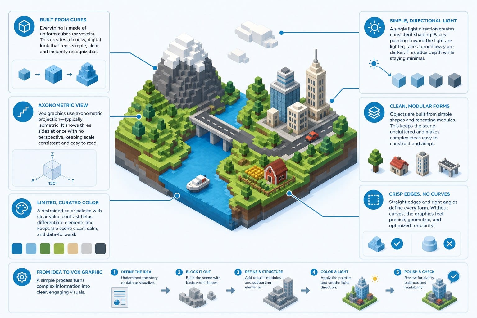
Before you can recreate a visual style, you need to understand what it is actually made of. Vox style graphics are not just pretty animations. They follow a specific visual logic that serves a purpose: helping viewers understand information quickly and clearly.
Let me break down the core ingredients.
Bold, animated typography
One of the most recognizable features is the use of large, clean sans-serif fonts that animate onto the screen in sync with narration. Words do not just appear. They slide in, scale up, or fade in at exactly the moment the narrator says them. This keeps the viewer reading and listening at the same time, which helps information stick.
The fonts are almost always geometric or humanist sans-serifs. Think clean, modern, and highly legible even on a phone screen. The text often uses a limited color palette, usually two or three colors that complement each other without competing.
Motion graphics that serve the explanation
In this style, every graphic element exists for a reason. If a narrator is explaining how a supply chain works, you might see a simple animated diagram that shows goods moving from one point to another. If the topic is a historical timeline, you might see a horizontal line with dates that build as the story progresses.
The key distinction here is restraint. The graphics do not try to be flashy for the sake of it. They are tools that make an argument or illustrate a process. That is actually what makes them feel so polished, because every element earns its place on screen.
Map animations and geographic overlays
Another staple is the animated map. Vox and similar outlets use maps constantly, and they do it well. A region gets highlighted, a border shifts to reflect a historical change, or pins drop onto cities as the narrator mentions them. These are not static screenshots. They are smooth, motion-graphic maps that feel like they are alive.
You can build these using tools like Adobe After Effects with map assets, or you can use platforms that have map animation built in. The critical thing is that the motion should match the narration pace exactly.
Data visualizations that move
Bar charts, line graphs, and pie charts are common in explainer content. What separates the Vox approach from a basic presentation is that the data grows or transitions on screen in a way that feels dramatic and purposeful. A bar does not just appear at full height. It rises from zero in a satisfying animation timed to the moment the narrator names the statistic.
This technique makes data feel like a story, not just a table of numbers. It is one of the most effective ways to hold viewer attention during what could otherwise be a dry segment.
A consistent color system
Colors in this style are chosen deliberately. There is usually a primary brand color, one or two accent colors, and a neutral background. Everything on screen fits within that system. This consistency is part of what makes the whole thing look professional rather than cobbled together.
You do not need a graphic design degree to pick a good color palette. Tools like Coolors or Adobe Color can help you generate a harmonious set of three to five colors in minutes. The discipline is in sticking to that palette throughout your entire video.
The relationship between audio and visuals
Perhaps the most underrated aspect of this style is how tightly the visuals are edited to the voiceover. In a well-made explainer video, graphics appear at the exact moment they are mentioned. The pacing of text animations matches the cadence of the narrator's speech. Nothing is early, and nothing is late.
This synchronization is what separates amateur explainer videos from ones that feel broadcast-quality. It requires careful editing, strong scripting, and sometimes multiple rounds of timing adjustments. If you want to go deeper on the foundational principles behind this look, the Vox animation style explained for video creators breakdown covers the building blocks in more detail.
How to build vox style graphics step by step
Now that you know what this style looks like under the hood, let me walk through how to actually build it. I am going to cover both the manual approach using traditional tools and the faster route using AI-powered video platforms.
Step 1: Start with a strong script
This might surprise you, but the script is the most important part of producing vox style graphics. Every visual decision flows from what is being said. When you write your script, you should already be thinking about what will appear on screen at each moment.
A good practice is to write your script in two columns: one for narration and one for the visual or graphic that will appear at that moment. This is called a two-column script or an AV script. It forces you to plan your visuals as you write, rather than trying to retrofit graphics onto a finished voiceover later.
Your script should be conversational and clear. Vox-style content works because the language is accessible, not academic. Aim for sentences that are short enough to follow while also processing visual information.
Step 2: Record or generate your voiceover
Once your script is locked, you need a voiceover. If you are running a faceless YouTube channel, you have two main options. You can record your own voice, or you can use AI text-to-speech tools to generate a narration track.
If you record yourself, use a decent USB microphone in a quiet room. Even a closet full of clothes works as a makeshift recording booth because the fabric absorbs echo. Edit out long pauses, breath sounds, and flubs using free tools like Audacity or the built-in audio tools in your video editor.
If you use AI-generated voice, make sure the pacing sounds natural. Synthetic voices have improved dramatically, but you still need to listen critically and adjust where the delivery sounds robotic or rushed. Many AI platforms let you add pauses or change emphasis, so use those features.
Step 3: Set up your visual template
In traditional production, this is where you open Adobe After Effects and start building your motion graphics templates. You would create text presets with your chosen font, set up your color palette as global variables, and build a library of reusable components like lower thirds, section titles, and data graphic templates.
This approach gives you maximum control, but it has a steep learning curve. After Effects is a professional tool that takes time to master. If you are willing to invest that time, there are free and paid template packs on platforms like Motion Array and Envato Elements that give you pre-built animations you can customize with your own colors and fonts. This shortcut dramatically reduces the time needed to get a polished look.
If you are not going the After Effects route, tools like Canva Pro, Adobe Express, and CapCut have motion graphics presets that can approximate parts of this style, though none of them match the precision of a full compositing tool.
Step 4: Animate your text to match the voiceover
This step is where most beginners underestimate the work involved. Import your voiceover into your editing or compositing timeline. Then, working phrase by phrase, place your text animations so they appear exactly when the narrator speaks the corresponding words.
Use keyframes to control when text enters and exits the frame. A simple fade-in that takes 10 to 15 frames feels snappy and professional. Longer animations start to feel slow. Shorter than 8 frames can feel too abrupt.
Test your timing by watching the segment back multiple times. If you are distracted by graphics appearing a beat too early or a beat too late, so will your viewers. Keep refining until everything feels effortless.
Step 5: Build and animate your data graphics
For charts, graphs, and timelines, the approach depends on your tool. In After Effects, you can use expressions or manual keyframing to make bars grow or lines trace across a graph. In simpler tools, you might need to simulate this by using shape layers that reveal over time.
If you are building a bar chart, start each bar at zero height with a keyframe, then set a second keyframe at full height a few seconds later and ease in the animation. This gives you that satisfying growing-bar effect without complicated coding.
For timelines, build each point as a separate element and animate them in sequentially. Each event appears as the narrator mentions it. Keep the visual design minimal so the motion carries the weight.
Step 6: Add maps and geographic elements
For map animations, you have a few options. Adobe Illustrator has detailed vector maps you can import into After Effects. Free resources like Natural Earth provide high-quality geographic data you can convert into usable vector assets. Once in After Effects, you can use masks or reveal effects to highlight specific regions.
If this feels too technical, there are After Effects plugins and template packs specifically designed for map animations. Some AI video platforms also include geographic visualizations as part of their motion graphics output, which is worth looking into if you are trying to streamline your production.
Step 7: Color grade and finalize
Once your graphics and voiceover are synced, apply your color palette consistently to anything that still looks out of place. Watch the full video from start to finish and look for anything that breaks the visual consistency: a font that is slightly different, a color that is off-brand, or a transition that feels jarring.
Export at the highest resolution your platform supports. For YouTube, that is 1080p or 4K at a high bitrate. Compression artifacts can make motion graphics look muddy, so do not over-compress.
Using AI to speed up the whole process
The manual process I just described is thorough, but it is also time-consuming. A single five-minute explainer video built this way can take twenty or more hours of work. That is not sustainable if you are trying to publish consistently.
This is where AI-powered video creation platforms come in. Tools like Cliptude can take a prompt or a script and handle the research, scripting, motion graphic generation, and editing automatically. Instead of spending a week building one video, you can produce polished, motion-graphic-driven content in a fraction of the time.
For faceless YouTube creators, educational content producers, and solo entrepreneurs who want professional output without a full production team, this kind of tool is genuinely useful. It handles the heavy lifting while still giving you a final product that looks structured and intentional, which is at the heart of what makes vox style graphics appealing in the first place.
Common mistakes that break the vox style look and how to fix them
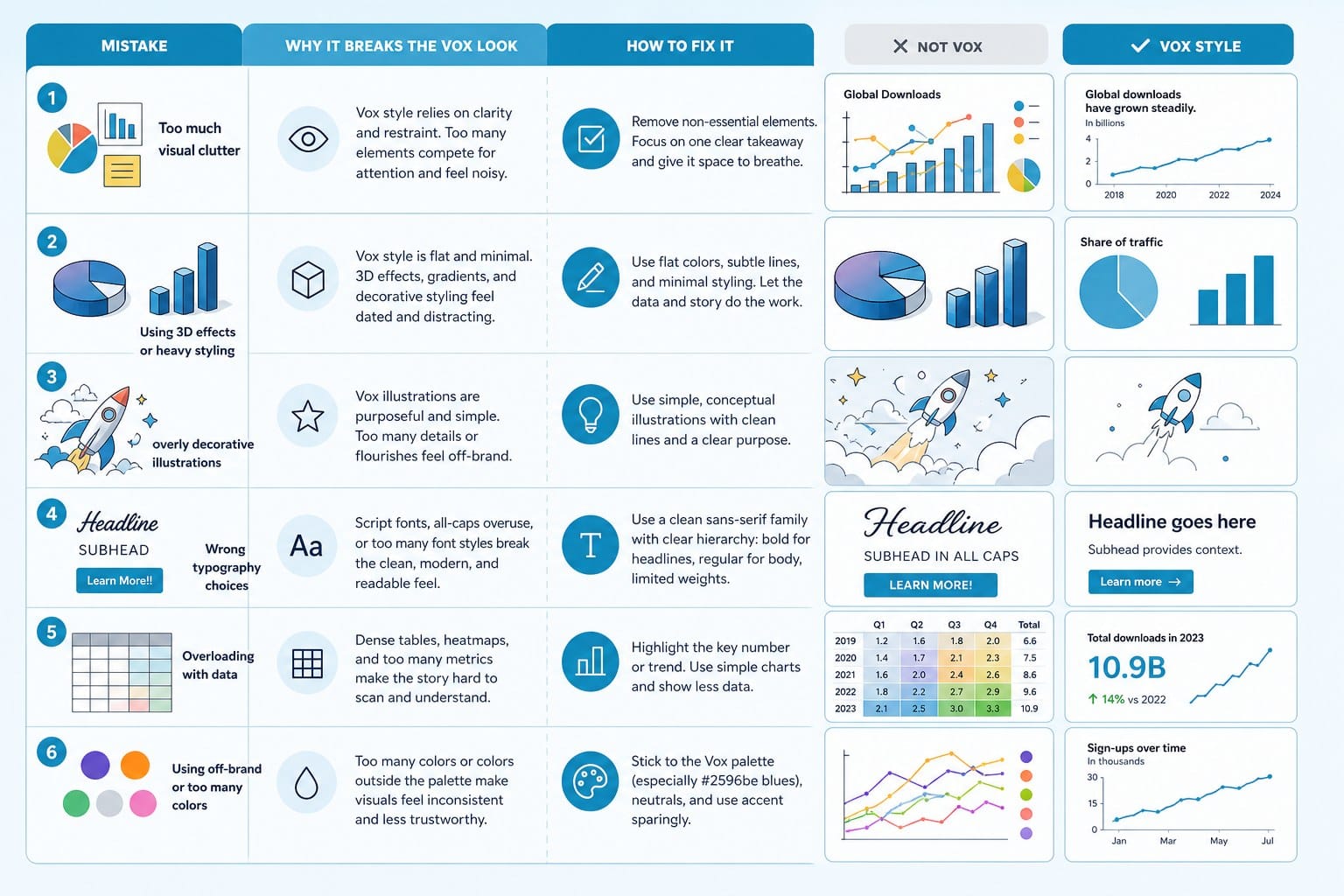
Even creators who understand this style conceptually often make the same handful of mistakes when they try to execute it. I want to walk through the most common ones because fixing them is often the difference between a video that looks amateur and one that looks broadcast-ready.
Using too many fonts
One of the fastest ways to undermine the clean, professional look of this style is to use multiple typefaces in the same video. I see this constantly in creator videos. Someone uses a bold sans-serif for headlines, a script font for callouts, and a serif for body text, and suddenly the whole thing looks inconsistent and chaotic.
Fix this by committing to one typeface family. Pick a sans-serif that has multiple weights, like Inter, Montserrat, or Source Sans Pro. All three are free on Google Fonts. Use bold weight for emphasis and regular weight for secondary text. That is all you need. The variety within a single type family is enough to create visual hierarchy without breaking visual harmony.
Overcomplicating the animations
Another common mistake is treating motion as decoration. Creators add bouncing text, spinning logos, and complex particle effects because they think more movement means better production value. In reality, it usually just makes the video harder to watch.
The vox style is disciplined about motion. Graphics come in cleanly, stay still while they are delivering information, and exit cleanly. The motion serves a purpose: it directs attention and signals that new information is arriving. If your animation does not serve one of those functions, cut it.
A good rule of thumb is to ask yourself whether the animation helps the viewer understand something better. If the answer is no, simplify it.
Ignoring audio-visual sync
I mentioned this earlier, but it is worth repeating because it is the single most common mistake in explainer content. When your graphics are even a half-second out of sync with your voiceover, it creates a subtle but persistent sense of discomfort for the viewer. They might not be able to name what feels off, but they will feel it.
To fix this, work in a timeline tool that shows your audio waveform and your video layers side by side. Watch segments at half speed to check whether text appears exactly on the syllable you intend. It is tedious work, but it is the difference between content that feels effortless and content that feels clunky.
Skipping the visual hierarchy
Visual hierarchy means that the most important information on screen is visually dominant, and supporting information is visually subordinate. If everything on screen looks equally important, the viewer does not know where to look first, and you lose them.
In practice, this means your main text should be significantly larger or bolder than any supporting text. Your primary color should appear on key data points or key phrases, not on everything. White space should be used deliberately to let the important elements breathe.
If you look at professional explainer videos in this style, you will notice that the screens rarely feel crowded. There is usually one dominant element, one or two supporting elements, and a lot of empty space. That restraint is intentional and effective.
Making graphics that cannot scale to different formats
If you are producing content for YouTube, TikTok, and Instagram Reels, you need to think about aspect ratio from the beginning. A graphic designed for a 16:9 widescreen YouTube video will not automatically work in a 9:16 vertical format for Reels or Shorts.
The cleanest approach is to design your core graphics in a square or flexible layout and then adapt them to each format. Text should be large enough to read on a phone screen, which typically means font sizes larger than you might initially think are necessary.
AI video platforms that are built for multi-format output handle some of this automatically, which is one of the practical advantages they offer for creators publishing across multiple platforms.
Not building a reusable template system
If you are producing videos regularly, rebuilding your graphics system from scratch for every new video is a massive time drain. The professional approach is to build a template library once and then use it repeatedly.
This means saving your font styles, color swatches, motion presets, and recurring graphic elements as reusable components. In After Effects, these are called motion graphics templates or MOGRTs. In Premiere Pro, you can import and customize them quickly. In simpler tools, templates or preset styles serve the same function.
Building this library takes time upfront, but it pays off quickly. After your third or fourth video, your production time drops significantly because you are not reinventing the wheel each time.
Underestimating the value of a good script
This brings me back to where I started. The visual quality of vox style graphics ultimately depends on the quality of the script. If your script is vague, disorganized, or padded with filler, no amount of animation polish will save the video.
A strong script has a clear argument or story. It moves from one point to the next without unnecessary detours. Each section builds on the previous one, and the ending feels earned. When you have that kind of writing under your graphics, the motion elements feel like they are serving something meaningful.
If scriptwriting is a weak point for you, AI tools can help here too. Platforms like Cliptude include scripting and research as part of their automated workflow, which means you are not starting from a blank page. That said, reviewing and refining the script before production begins is always worth doing, because a tighter script leads to tighter visuals.
Where to go from here
If you are exploring the full range of tools available for AI-powered video production, it is worth looking at comparisons of different platforms to find what fits your workflow. Articles like Best Vidai alternatives for AI-powered video creation and Best Tubegen AI alternatives for automated video creation walk through what different tools offer, which can help you make a more informed decision about where to invest your time and credits.
The goal is to build a system that lets you produce consistent, high-quality vox style content without burning out or blowing your budget. With the right combination of technique and tooling, that is genuinely achievable even as a solo creator.
Ready to take the next step?
If you want to skip the long production process and start creating professional explainer videos with motion graphics built in, Cliptude is worth trying. It is an AI-powered platform that handles research, scripting, graphics, and editing from a single prompt. You can go from idea to finished video without needing a design team or video editing experience. Visit Cliptude to see how it works and start your first project.