Vox animation style explained for video creators

Table of contents
1. What the vox animation style actually looks like
2. Why this style works so well for educational and explainer content
3. How to apply the vox animation style to your own videos
If you have ever watched a Vox explainer video, you know exactly what I am talking about. The clean motion graphics, the data-driven maps that animate in real time, the bold typography that pulses in sync with a narrator's voice. That visual language has become one of the most recognized styles in online video. Creators call it the vox animation style, and for good reason. Vox Media built something so distinctive that it now feels like its own genre. In this article, I want to break down exactly what makes that style work, why it resonates with audiences, and how video creators can use the same principles in their own productions, even without a full production team.
What the vox animation style actually looks like
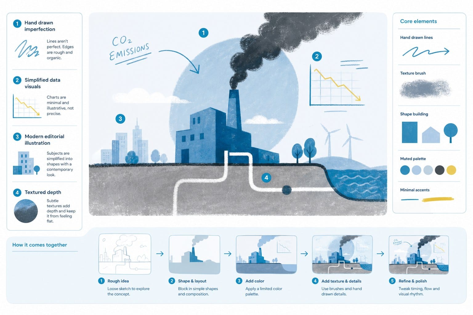
The vox animation style is not one single technique. It is a carefully assembled toolkit of visual decisions that all point in the same direction: clarity. Every element on screen serves the story. Nothing is decorative for its own sake.
The foundation of the style is flat, 2D motion graphics. You will not see 3D renders or photorealistic textures. Instead, shapes are simple, colors are bold, and lines are clean. Think of a world map where country borders animate into view one by one as a narrator explains a geopolitical shift. That animation does not exist just to look good. It exists because watching something appear in real time helps viewers understand sequence and cause and effect better than a static image ever could. When borders draw themselves across the screen in the order a narrator describes them, the viewer builds a mental model of events as they listen rather than trying to reconcile a finished image with spoken words after the fact.
Typography plays a huge role. Words appear on screen in heavy, sans-serif fonts that feel authoritative without feeling cold. Key phrases get highlighted or animated to match the beat of speech. This is not a stylistic flourish. It reinforces what the narrator just said and gives viewers two channels of information at the same moment, audio and visual, which helps retention significantly. When a narrator says the phrase "thirty-year trend" and those exact words appear on screen in bold at that precise moment, the idea lands twice as hard.
Color palettes tend to stay controlled. A Vox video might use three or four main colors across an entire segment. That restraint keeps the visual experience cohesive and prevents the eye from getting overwhelmed. When a new color does appear, it usually signals something important: a contrast, a comparison, a turning point in the story. A segment might use blue tones throughout a historical explanation, then shift to orange when it reaches the present-day implications. That color shift tells the viewer something changed before the narrator even says so.
Data visualization is another signature move. Charts, graphs, and timelines animate on screen in ways that feel intuitive rather than dry. A bar chart does not just appear fully formed. The bars grow. A timeline does not sit static. It scrolls left to right as the narrator walks through it. These micro-animations are what separate an explainer video from a slideshow. They give data a sense of movement and consequence. When you watch a line on a graph climb steeply upward while a narrator describes an economic crisis, you feel the trajectory in a way you simply do not when you look at a finished chart.
Camera movement in Vox-style animation tends to be smooth and purposeful. A slow zoom into a detail on a map. A pan across a graphic as new elements appear. These moves guide the viewer's attention without creating confusion. The pacing is deliberate. There is breathing room between ideas so the audience can absorb what they just saw before the next thing arrives. A video might hold on a single map for eight or ten seconds while the narrator makes three separate points, using subtle zooms and callout labels to direct focus rather than cutting to a new visual for each point.
Narration is the backbone of everything. The vox animation style is built around voice. The script drives every animation decision. When the narrator says a country's name, the map zooms to that country. When they describe a percentage, a pie chart or progress bar fills in to match. The visuals are always reactive to the words, not the other way around. This is a critical production philosophy. Many amateur explainer videos build graphics first and then write narration to describe those graphics. The result feels like a tour of slides. Vox-style content feels like a guided argument because the script is always in command.
This approach differs from other explainer formats in meaningful ways. Whiteboard animation leans on a hand drawing things in real time, which creates a sense of live explanation but limits the visual complexity you can achieve. Character animation uses simple figures to humanize abstract ideas, which works well for process explanations but can feel lightweight for data-heavy topics. The vox animation style skips both of those in favor of information design. It treats the viewer as someone who can handle complexity, as long as that complexity is laid out carefully and sequentially.
Pacing deserves a final note here because it is easy to overlook as a visual element. Vox videos tend to move faster than traditional documentaries but slower than social media clips. That sweet spot keeps viewers engaged without losing them. It respects their attention without underestimating their curiosity. A typical segment might introduce a new visual idea every four to six seconds, which is fast enough to feel energetic but slow enough to allow comprehension. That rhythm is something you can feel when you watch enough of this style, and it is something you can consciously build into your own edit decisions.
Why this style works so well for educational and explainer content
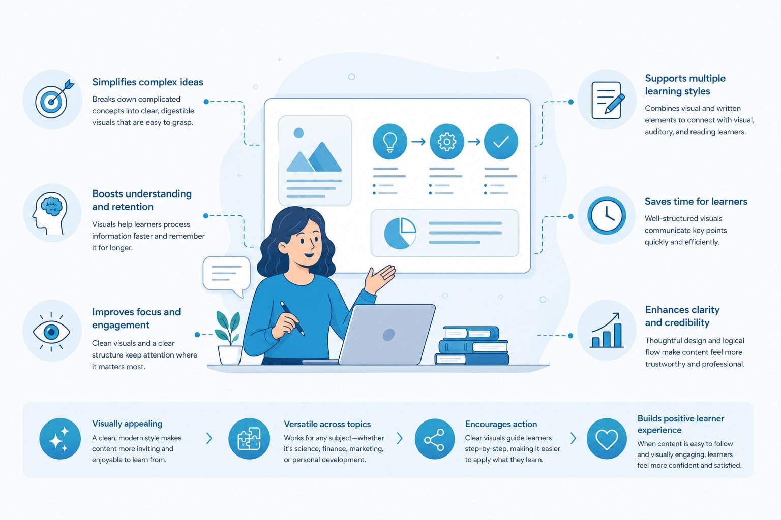
The vox animation style became popular for a reason that has nothing to do with aesthetics. It works. It actually helps people understand complex things, retain them, and share them. Once you break down why, those lessons apply to any type of educational or explainer video you are making, regardless of topic or platform.
The first reason it works is cognitive alignment. Human brains process visual information and verbal information through separate channels. When you show someone a moving graphic while a narrator speaks, both channels engage simultaneously without competing. Psychologists call this dual-coding, and it has been studied extensively in learning research. The core finding is consistent: people learn and remember more when information arrives through two aligned channels at once rather than one. The vox animation style is essentially built around this principle. Every animation is designed to complement what is being said, not distract from it.
Consider how a Vox segment on income inequality might work. The narrator explains that the top one percent of earners saw wages grow at three times the rate of median workers over three decades. As those words land, a graph animates into view showing exactly that gap growing over time. The viewer does not have to imagine the disparity. They see it. That visual confirmation locks the idea in place in a way that narration alone cannot. The same information delivered over a talking head or a static slide would generate a weaker memory trace and less emotional impact.
The second reason is trust signaling. Clean, well-produced motion graphics tell the viewer that someone did their homework. It is a visual cue that says this information is serious and worth your time. When data is presented in a polished, structured format, audiences are more likely to engage with it and share it. This is partly why the style spread beyond Vox to news organizations, educational channels, and nonprofit communications teams. A nonprofit explaining a housing crisis with an animated map and clean data visualizations signals competence and care in a way that a hastily edited video over stock footage simply does not.
This does not mean expensive production is required to earn that trust. It means intentional production does. A video made with modest tools but tight visual discipline, consistent colors, clean typography, and animations that serve a purpose, reads as credible. A video with high production spend but chaotic visual choices does not. The style is about choices, not budgets.
The third reason is versatility. The vox animation style works for almost any topic. Politics, science, economics, history, culture, public health, urban planning. Because the core toolkit is about information design rather than any specific subject matter, creators can apply it broadly. A video about climate migration and a video about the history of the shipping container can both use the same visual language and feel equally compelling. That flexibility is rare. Most visual styles carry genre associations that limit their use. The vox animation style reads as authoritative and informative regardless of what it is explaining.
For YouTube creators specifically, this style has another major structural advantage: it does not require anyone to appear on camera. Faceless channels have grown substantially because they lower the barrier to entry for creators who either do not want to be on screen or whose topics do not benefit from a presenter-style format. The vox animation style fits perfectly into that model. The narrator's voice carries the personality and credibility of the channel while the graphics do the visual storytelling. A solo creator can produce a genuinely professional explainer video without a camera, a backdrop, or on-camera confidence.
Let me give you a concrete example of how this plays out. Imagine you are running a YouTube channel about global economics. You want to explain why supply chains broke down during a major disruption. You could film yourself talking at a camera. You could use stock footage of shipping containers and cargo ships. Or you could build an animated map that shows goods moving from factories in one region to ports to distribution centers to retailers across multiple continents, then animate that flow breaking apart step by step as the narrator explains each failure point in sequence. The third option is more memorable, more shareable, more search-friendly, and easier to produce without on-camera talent or B-roll licensing costs.
The style also ages better than footage-based content. Because the vox animation style does not rely on live video that can look dated within a few years, videos made with clean flat graphics tend to hold their value in search results for much longer. A well-designed animated explainer about a topic from five years ago can still perform today because the information stays accurate and the visuals stay clean. Live footage from the same period might feel visually stale or reference visual contexts that now feel dated. Animation does not carry that baggage.
There is also a democratization angle worth addressing directly. When this style first emerged, it required teams of skilled motion graphics designers working in software like Adobe After Effects, with render times, revision cycles, and production costs that only well-funded media companies could sustain. That is no longer the picture. Tools have evolved, workflows have improved, and AI-powered platforms have changed what a solo creator can produce independently.
If you want to explore what different platforms bring to that workflow, Best Tubegen AI alternatives for automated video creation is a useful place to compare the landscape. The options available today make the vox animation style genuinely accessible to individual creators in a way it simply was not a few years ago, and understanding that landscape helps you choose tools that match your content type and output goals.
One more thing worth naming: audience expectations have shifted. Viewers who grew up watching Vox, Kurzgesagt, and similar channels have internalized this visual language. They expect data to animate. They expect typography to reinforce speech. They expect information to be presented with structure and visual hierarchy. When a creator meets those expectations, the content feels native to the medium. When a creator ignores them and delivers information through static slides or unedited talking-head footage, the content feels like it belongs to an older era of online video, even if the information itself is excellent.
How to apply the vox animation style to your own videos
Understanding the vox animation style is one thing. Building it into your own video workflow is another. Here is a practical breakdown of how to approach this, whether you are starting from scratch or trying to level up content you are already producing.
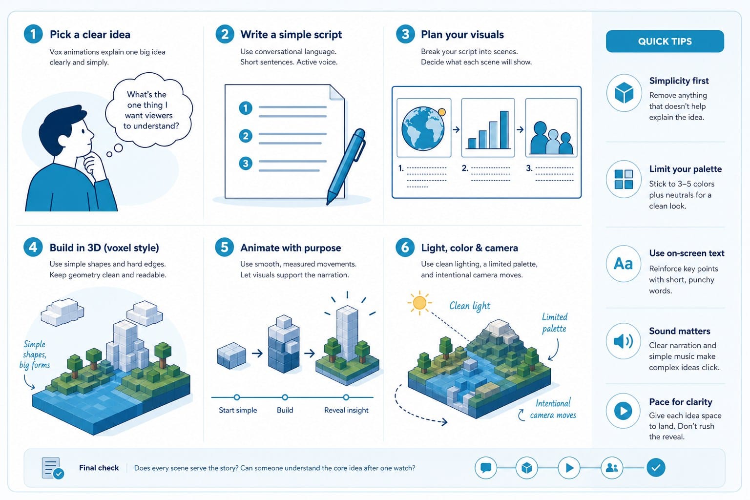
Start with the script, not the visuals. This is the single most important principle and the one most creators skip. The vox animation style is voice-led. Everything on screen responds to what is being said. So before you think about a single animation or color palette, write your script in full. Read it out loud. Time it. Identify every beat where a visual could reinforce or extend the meaning of what is being said. If a sentence has no clear visual counterpart, that is a signal to either rewrite the sentence or question whether that information belongs in a video format at all.
A useful technique is to build your script in a two-column document. Left column: your narration, broken into short phrases or sentences. Right column: a brief description of what should appear on screen at that moment. This is a simplified storyboard that does not require any drawing skill. You are just describing visual actions in plain language: map zooms to Southeast Asia, bar chart grows to show 2008 figure, text label reads annual growth rate. By the time you finish this document, you have a production plan. The animation build becomes a matter of execution rather than improvisation.
Next, establish your visual system before you build a single asset. This step saves enormous time and prevents the inconsistency that makes amateur explainers look rough. Choose two to four colors and commit to them. Choose a font family, ideally one or two weights of a clean sans-serif like Inter, Montserrat, or a similar option. Decide on a consistent animation behavior for text and shapes. Will things slide in from the left? Fade up from zero opacity? Scale in from a small size? Pick one or two motion styles and apply them consistently throughout. That consistency is what makes the finished product feel like a cohesive production rather than a collection of individual graphics.
If you define these choices in a simple style guide document before you start, you will make faster decisions during the build phase and your videos will develop a recognizable visual identity over time. That identity compounds in value as your channel grows. Viewers start to recognize your work before they even see your channel name.
Data presentation deserves its own attention because it is where many creators either fail to commit or overcomplicate things. If your video includes statistics, timelines, or comparisons, do not just put a number on screen. Animate it in a way that makes the magnitude feel real and tangible. A figure like 42 million displaced people does not land emotionally as a text label. It lands when you show it scaling as a bar relative to something the viewer already has a mental model of, or when you map it as a population density visualization across a geographic region, or when you animate it as a progression over time so viewers can feel the rate of change. The goal is to translate abstract data into something the eye can experience.
Keep animations simple and purposeful. This is where creators who are excited about motion design most often go wrong when trying to emulate this style. They add too much movement. Every transition does not need to be elaborate. A smooth fade or a clean directional slide is often more effective than a complex kinetic sequence. The vox animation style earns its reputation through restraint and purpose, not through visual busyness. When in doubt, do less. Let the narration carry the complexity and use animation only to reinforce the most important moments.
For creators who do not have motion design backgrounds, AI-powered tools have made this category of content dramatically more accessible. Platforms like Cliptude can take a script or a topic prompt and produce polished video content automatically, handling research, scripting, visual assets, narration, and editing in a single workflow. For faceless YouTube channels focused on educational or documentary-style content, this kind of platform means you can produce explainers at a consistent output pace without needing to hire a motion designer or invest months into learning After Effects.
The Cliptude review: AI video creation from prompt to polished edit walks through the platform's capabilities in practical detail if you want to understand what is realistic before committing to a workflow. The key question for any AI video tool is whether its output matches the visual discipline that makes the vox animation style effective, and that review addresses it directly.
Voiceover quality matters more than most creators realize. The vox animation style lives or dies on the narration. A rough, poorly recorded voiceover will undermine even the most polished graphics because the narration is the structural spine of everything else. Record in a space with minimal reverb, keep background noise out, and edit out hesitations and mouth sounds. If you are not comfortable recording your own voice, AI voiceover tools have improved substantially and can produce natural-sounding narration that works well in this style. The standard for what sounds acceptable has risen as audiences have become accustomed to cleaner audio.
Pacing is something to audit carefully in your edits. Play back your finished video and time how long each visual stays on screen before something changes. A graphic that appears for under two seconds gives most viewers insufficient time to register it. A single visual held for fifteen seconds or more with no movement or new information will cause attention to drift. The vox animation style typically introduces a new element, adds to an existing graphic, or makes a small camera move every three to six seconds. That rhythm keeps the video feeling active without becoming chaotic. Build this check into your editing process deliberately rather than relying on feel alone.
Sound design contributes more than creators often budget attention for. A clean, understated musical score that does not compete with narration adds professionalism and emotional depth. Subtle audio cues when graphics animate in, a brief tonal shift or a soft textural sound, make transitions feel intentional rather than mechanical. These are small details individually, but they accumulate into the difference between a video that feels polished and one that feels assembled.
Study the editorial structure of videos that use this style well, not just the visual execution. Notice how the best explainers open with a question or a counterintuitive claim that creates immediate tension. Notice how they build through a sequence of revelations rather than presenting all their information at once. Notice how they close with a takeaway that recontextualizes what the viewer just learned rather than simply stopping when the information runs out. The vox animation style is as much about editorial architecture as it is about motion design. The visuals support the story, but the story has to be constructed first.
For creators who want to explore platform options beyond a single tool, Best Vidai alternatives for AI-powered video creation offers a useful comparison of what different platforms prioritize in their output. Finding the right workflow for your content type and publishing cadence makes a real difference when you are trying to build a channel with consistent quality over time.
The vox animation style is achievable for solo creators today in a way it genuinely was not five years ago. The principles are learnable from careful observation. The tools are accessible at multiple price points. The audience appetite for well-made explainer content is as strong as ever, and in many topic categories, the competition for well-produced educational video remains lower than you might expect. Start with a clear script, establish a consistent visual system, let the narration lead all production decisions, and keep your animations purposeful rather than decorative. Those four habits will carry you a long way toward producing videos that feel genuinely professional and hold their value over time.
Ready to take the next step?
If you want to start producing explainer videos in the vox animation style without spending months inside motion design software, Cliptude is built for exactly that workflow. You bring the topic or the script, and the platform handles the research, narration, graphics, and editing automatically. Visit Cliptude to see what your next video could look like.