Vox texture explained: what it is and how it works in video

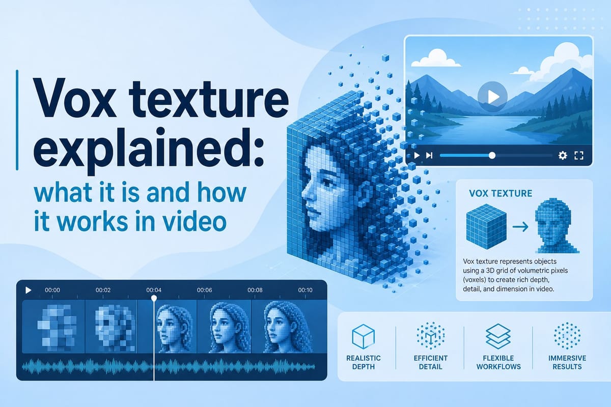
Table of contents
1. What vox texture actually is and where it comes from
2. How vox texture functions inside a video and why it works
3. How to use vox texture in your own videos without starting from scratch
If you have ever watched a Vox explainer video and thought, 'why does this feel so different from everything else on YouTube?' you are not alone. There is a specific visual quality to those videos that people recognize instantly, even before they hear a word of narration. That quality has a name in the creator community: vox texture. It refers to the layered, tactile, slightly rough visual style that Vox media made famous in their data journalism and explainer content. In this article, I am going to break down exactly what vox texture is, where it comes from, how it functions inside a video, and how you can start using it in your own productions. Whether you run a faceless YouTube channel, create educational content, or just want your videos to feel more polished and intentional, understanding this style can genuinely change how your audience responds to your work.
What vox texture actually is and where it comes from
Vox texture is a visual design approach that combines flat or semi-flat graphic elements with subtle surface textures, giving digital graphics a slightly worn, paper-like, or screen-printed quality. The result is something that feels hand-crafted and warm rather than cold and corporate. It became widely recognized through Vox media's explainer videos, which consistently used this aesthetic alongside bold typography, animated maps, and color-coded data graphics.
The term itself is not an official design category. It grew organically as creators noticed a consistent look across Vox content and started trying to replicate it. If you search for it in design communities or creator forums, you will find people describing it in slightly different ways, but the core idea is always the same: flat graphics with added grain, texture overlays, or noise that makes them feel more physical.
To understand why this matters, think about the difference between a billboard and a risograph print. A billboard is smooth, clean, and digitally perfect. A risograph print has ink bleed, slight misalignment, and a texture you can almost feel with your eyes. Vox texture sits somewhere in that second category. It introduces just enough imperfection to make your brain register the image as something crafted by a person, not generated by a machine.
The technical ingredients usually include a few key elements. First, there is a base color palette that tends toward muted, earthy tones mixed with a few bold accent colors. Second, there are grain or noise overlays placed on top of solid shapes to give them depth without using traditional 3D rendering. Third, there is bold, clean typography that contrasts with the textured backgrounds, keeping the information readable even as the visuals feel rich and layered. Fourth, there are often flat illustrated elements like simple maps, icons, charts, and arrows that carry the same textured treatment.
This combination of grain, flat illustration, strong type, and restrained color is what people mean when they say something has a vox texture. It is not just about adding a filter. It is a deliberate design philosophy where every layer of the image has been considered.
The historical roots of this aesthetic go back further than Vox itself. Screen printing, letterpress, and early magazine print design all relied on texture as a byproduct of the medium. When digital design arrived, that texture disappeared because pixels are inherently smooth. Designers who missed the warmth of print started adding texture back deliberately, and that impulse eventually made its way into motion graphics and video content. Vox just happened to systematize it and apply it at scale in a way that millions of viewers noticed.
For video creators, the significance of this is practical. Your audience is not consciously thinking about grain overlays when they watch your content. They are just responding to how the video feels. A video with vox texture tends to feel authoritative without feeling cold, creative without feeling chaotic, and professional without feeling generic. Those qualities keep people watching and make your channel easier to recognize in a crowded feed.
If you want to go deeper on how this style translates into actual graphics, the guide on how to create Vox style graphics for your videos breaks down the practical steps in detail.
How vox texture functions inside a video and why it works
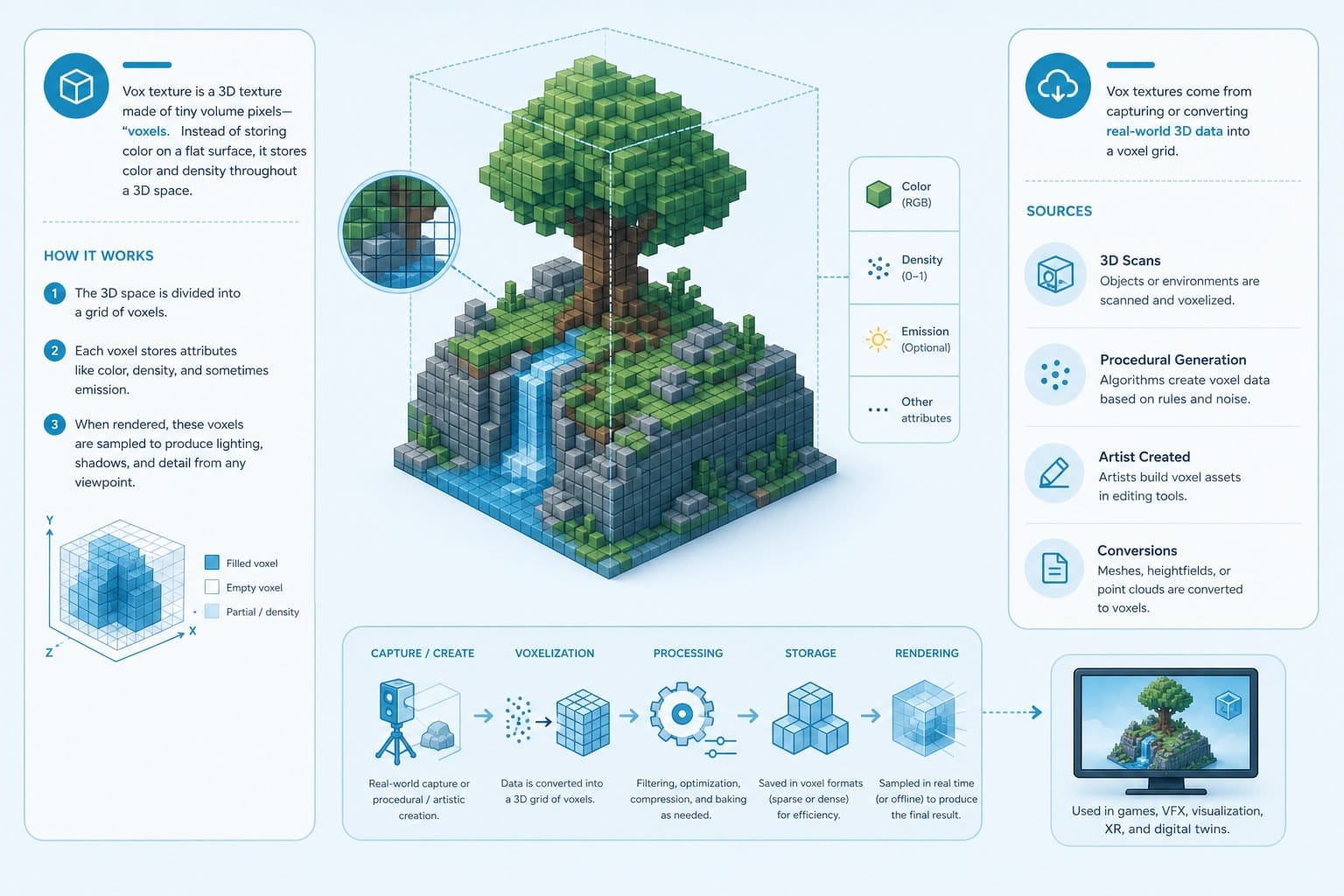
Understanding what vox texture looks like is one thing. Understanding how it functions inside a moving video is another. In motion, texture behaves differently than it does in a static image. It has to serve the video without distracting from it, and when it is done well, it becomes almost invisible. You feel it more than you see it.
The first way vox texture functions is by creating visual hierarchy through contrast. When you place a heavily textured, color-blocked background behind clean white typography, the type pops forward immediately. Your eye goes straight to the information because the textured background recedes. This is a classic figure-ground relationship, and the texture amplifies it. Without the grain, a flat color background can compete with the text, especially on screens with varying brightness levels. The texture adds depth that separates layers.
The second function is brand consistency across different types of shots. Most explainer videos mix stock footage, animated graphics, and title cards. Keeping these elements visually unified is one of the hardest challenges in video editing. When you apply a consistent texture treatment across all your motion graphics, maps, and lower thirds, they all feel like they belong to the same visual world even if the footage behind them came from completely different sources. The texture acts as a binding agent.
Think about how this plays out in a documentary-style video about climate change. You might cut between satellite footage, interview clips, animated data charts, and illustrated maps. Without a unifying visual treatment, those cuts feel jarring. With a consistent vox texture applied to all the graphic elements, each cut feels like a chapter in the same book rather than a jump between different projects.
The third function is communicating credibility and craft. This is subtle but important. Audiences have trained themselves, often unconsciously, to associate certain visual qualities with quality journalism and careful production. The vox texture aesthetic is linked in many viewers' minds to educational, fact-based content. When your video uses this style, you borrow some of that credibility signal. It tells the viewer that care went into this, before they have processed a single word of your script.
For faceless channels in particular, this matters a lot. When there is no host on camera building a personal connection with the viewer, the visual style has to do more of that relational work. A well-executed vox texture tells the viewer something about who made this video and what they value. It signals intentionality.
Fourth, the texture works with motion in a specific way. In static design, texture sits still. In video, you have choices. Some creators animate the texture itself, letting the grain subtly shift frame by frame to give graphics a living, breathing quality. This is called animated grain or animated noise, and it is one of the more striking features of professional motion graphics in this style. It prevents the graphics from looking like a still image that was dropped into the timeline. Even a small amount of animated grain can make flat graphics feel alive.
Other creators apply texture as a static overlay and let the animated elements underneath move while the texture stays fixed. This creates a different effect, more like a printed animation cell moving behind a fixed surface, which can feel deliberate and stylized.
The choice between animated and static grain depends on the energy of your content. Fast-paced listicle videos with quick cuts often use animated grain because it matches the kinetic energy of the edit. Slower documentary-style content sometimes benefits from static texture because it feels more considered and calm.
Fifth, color and texture work together in this aesthetic in a way that is worth understanding. Vox-style palettes tend to use colors that are slightly desaturated, what designers call muted or dusty tones. When you add grain to a fully saturated color, the grain can get lost. When you add grain to a muted color, the grain shows up clearly and the texture reads immediately. This is why the color choices in this style are not arbitrary. They are engineered to make the texture visible and effective.
For a broader look at how this style applies across different video formats and motion design approaches, the article on Vox animation style explained for video creators is worth reading alongside this one.
One more thing worth noting: vox texture is not about making things look old or damaged. It is about making things look made. There is an important distinction there. Intentional texture communicates craft. Unintentional texture looks like a mistake. The difference is in the execution: clean shapes, deliberate color choices, and texture that is controlled and consistent rather than randomly applied.
How to use vox texture in your own videos without starting from scratch
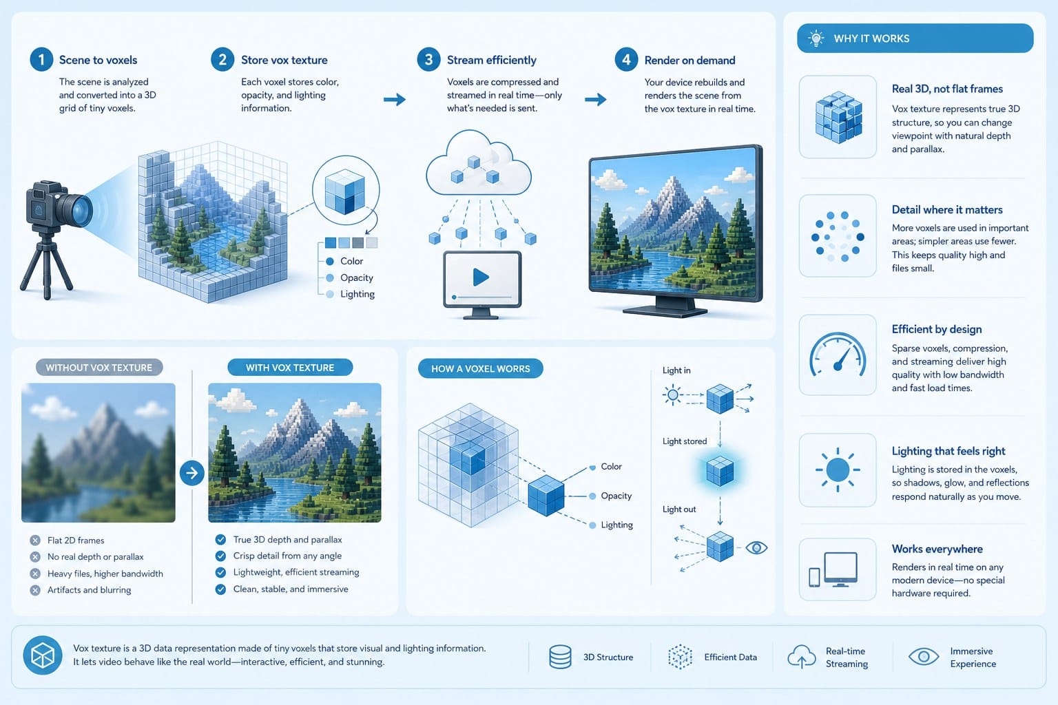
Knowing what vox texture is and how it works is useful. Knowing how to actually put it into your videos is where the real value lives. I want to walk through the practical side of this, including the tools and approaches available to creators at different skill levels.
The traditional method involves working in a motion graphics application. You build your graphics using vector shapes to keep edges clean and scalable. You apply a grain or noise effect either through the application's built-in tools or through a separate texture overlay imported as a PNG or video file. You set the blending mode on the texture layer to something like Multiply or Overlay, then reduce the opacity until the texture reads without overwhelming the design underneath. You repeat this process for every graphic element in your video.
This works well and gives you precise control. It is also time-consuming, especially if you are producing multiple videos per week. Each graphic has to be built individually, the texture has to be calibrated for each background color, and when you export everything it has to match across the whole project. Experienced motion graphic designers can work this way efficiently, but for creators who do not have that background, the learning curve is steep.
The intermediate approach is to use templates. Many creators have shared Vox-style template packs for major editing applications. These templates come with the texture work already done. You replace the placeholder text and data with your own content, adjust colors to match your brand, and export. The result looks consistent and professional without requiring you to build everything from scratch. The limitation is flexibility. If the template was not designed for your exact use case, you may find yourself fighting the structure instead of working with it.
The more advanced challenge is consistency across a full video. Even with good templates, maintaining a coherent vox texture look across every type of graphic in a 15-minute documentary requires discipline. Your title cards, your lower thirds, your data charts, your maps, and your transition graphics all need to feel like they came from the same visual system. That requires either a lot of manual work or a workflow that handles it systematically.
This is where AI-powered video creation tools start to change the equation significantly. Platforms that can generate and apply consistent motion graphic styles across an entire video from a single prompt or script take the texture problem off your plate. Instead of building every graphic individually and manually applying grain overlays, you describe what you need and the platform produces graphics that already share a visual language.
Cliptude works this way. When you create a video through Cliptude, the platform researches the topic, writes the script, sources footage, generates motion graphics, and edits the full video. If you are going for a documentary or explainer style with consistent visual design, the graphics come out unified rather than assembled from mismatched pieces. For creators who want the visual authority of a vox texture look without the production overhead, this kind of automated workflow dramatically lowers the barrier to entry.
For faceless channel operators producing long-form documentary or listicle content, the efficiency here is significant. A solo creator who might spend two or three days producing a single Vox-style explainer video can compress that timeline substantially when the scripting, graphics, and editing are handled by the platform. The credit-based pricing model on Cliptude means you pay based on what you produce rather than committing to a fixed subscription, which makes it practical for creators at different output levels.
For educational and explainer content creators specifically, maintaining stylistic consistency across dozens of videos builds brand recognition over time. Audiences start to associate your visual style with your channel before they even click. A consistent vox texture look across your library tells returning viewers they are in familiar territory and signals to new viewers that this channel takes its presentation seriously.
There are also some practical things to watch for when you are applying this style yourself. First, do not over-texture. A common mistake is adding so much grain that the texture competes with the content. The grain should be visible enough to feel present but light enough that it disappears into the design when you are focused on reading the information. Test your graphics on different screens because grain reads differently on a phone display versus a large monitor.
Second, keep your color palette tight. Vox-style work typically uses four to six colors maximum. When you expand beyond that, the design starts to feel chaotic and the texture stops holding it together. Pick your palette before you start building graphics and stick to it across the whole video.
Third, match your typography to the style. Bold, clear sans-serif typefaces work best in this aesthetic. The type needs to be readable even on a heavily textured background, and decorative or script fonts usually fail that test. The classic approach is to use one typeface in two or three weights, letting the weight variation create hierarchy rather than introducing multiple fonts.
Fourth, be consistent with how you treat different types of graphics. If your data charts have animated grain, your maps should too. If your title cards use a specific overlay opacity, your lower thirds should match. Inconsistency in texture treatment is immediately visible even to viewers who cannot name what they are looking at. It makes the video feel assembled rather than designed.
For creators who are exploring AI video tools and want to understand what is available across the market, the comparison article on best Vidai alternatives for AI-powered video creation gives a useful overview of how different platforms approach automated video production.
One final point worth making: vox texture is a style, not a formula. The creators who use it most effectively are not just copying Vox's visual choices. They are understanding the underlying principles, controlled imperfection, strong hierarchy, visual warmth, and brand consistency, and applying them in ways that fit their own content and audience. If your channel covers technology, your palette and graphic shapes might skew more geometric and cool-toned while still using the same grain-and-flat-design approach. If your channel covers history or culture, you might pull the colors warmer and let the texture feel more like aged paper. The style is flexible enough to absorb those adaptations while still communicating the same fundamental qualities that make it effective.
Ready to take the next step?
If you want to start producing explainer and documentary-style videos with this kind of visual quality without building every graphic yourself, Cliptude can handle the heavy lifting. From research to script to finished video, the platform automates the production workflow so you can focus on the ideas behind your content. Head to cliptude.com to try it and see what your next video looks like.